PALLISER RIDGE
Palliser Ridge is a remote farm station located at the bottom of the North Island. It’s a true 21st-century station; not only is Palliser Ridge a working farm, but the family business also offers farm-stay accommodation, farm tours, workshops, and supplies locally made products to both the domestic and international market. Their product line includes handmade wool products and yarn, honey, and lamb - all sourced from the farm itself.
The business had an established logo that they wanted to maintain, but to help them launch their new offerings, Palliser Ridge wanted to build out their brand identity and assets. In particular, they needed an identity that would work across product packaging, collateral and signage.
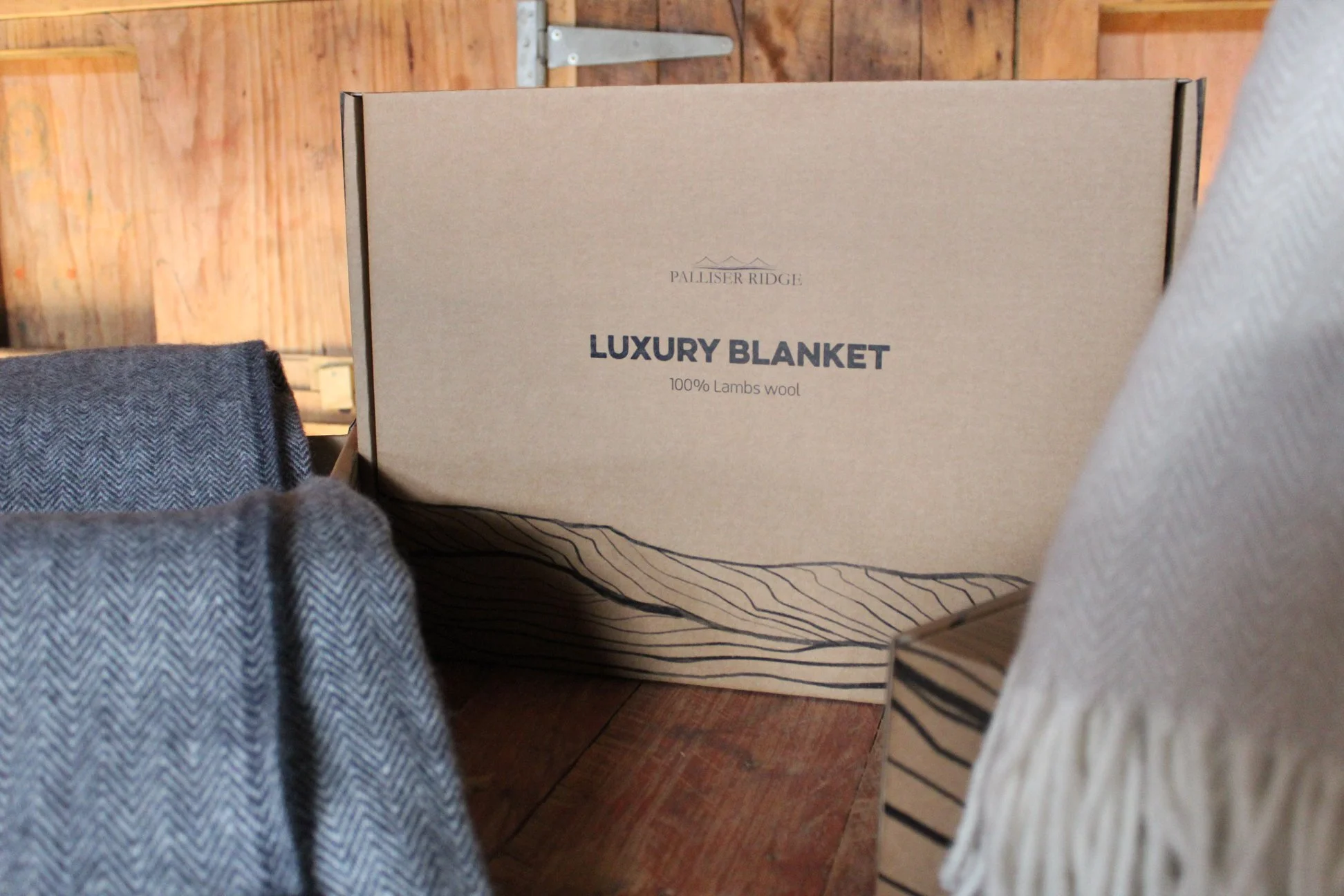
We developed an illustration which is core to the brand and symbolic of its iconic location on the coast - contoured linework depicting the Palliser Ridge landscape - the cliffs, rolling hills and ridgelines. We also added a key headline type, which is bold, yet harks back to the natural ethos of the business. We developed a colour palette and iconography that helps to distinguish their three core product offerings; wool, honey, and lamb.
The result is a modern-day farming brand that works across the various Palliser Ridge products and services, distinguishing the family business from the traditional farm model.
Blanket boxes and crates of wool imagery sourced from palliserridge.co.nz


